Advanced Typography - Project 2

21/05/19 - 28/05/19 (Week 8 - 9)
Azmina Fathima Haris (0337113)
Advanced Typography
Project 2
LECTURES
Lecture 8: No lecture
Week 8 (21/05/19)
We continued working on our posters and our key artwork this week.
Lecture 9: No lecture
Week 9 (28/05/19)
We didn't have a lecture, instead we worked on our improving our collateral and poster, which was due for submission.
INSTRUCTIONS
Project 2
After having my key artwork approved, I started working on the poster and the collateral. I chose to create a sweatshirt and ID cards/event passes for the speakers, guest and crew. I felt this was something different but would also be fairly easy to create based on the poster.
 |
| Fig. 1 Process in Illustrator |
 |
| Fig. 1.1 Poster - initial attempt |
 |
| Fig. 1.2 Event pass - speaker |
 |
| Fig. 1.3 Event pass - guest |
 |
| Fig. 1.4 Event pass - crew |
 |
| Fig. 1.5 t-shirt - front |
 |
| Fig. 1.6 t-shirt - back |
In class, after consulting with Mr. Vinod and Mr. Shamsul, I ended up making a few changes to my work. I was asked to adjust the composition of my poster a little bit as it looked off. Mr. Vinod suggested making changed to my event pass as he felt it didn't look connected to the poster and told me to do something similar (based on a window created from my poster as shown below). After making these changes, I mentioned that the event pass would be temporary, and Mr. Vinod suggested I could turn the passes into Touch n Go cards instead so that they would have a reason to hold on to the cards. I made a few final changes to the t-shirt as well.
 |
| Fig. 1.7 Sample created from poster for revised event pass |
 |
| Fig. 1.8 Tshirt - final |
 |
| Fig. 1.9 Touch n Go card - speaker |
 |
| Fig. 2 Touch n Go card - guest |
 |
| Fig. 2.1 Touch n Go card - crew |
Poster - final
Microsite for event (View webpage)
 |
| Fig. 2.2 Browser window #1 |
 |
| Fig. 2.3 Browser window #2 |
 |
| Fig. 2.4 Browser window #3 |
 |
| Fig. 2.5 Browser window #4 |
 |
| Fig. 2.6 Browser window #5 |
 |
| Fig. 2.7 Full webpage |
Final outcome - flat lay
 |
| Fig. 2.8 Collaterals - Poster, Touch n' Go cards (for speaker, guest and crew) and the t-shirt (front and back) |
Printed outcome
 |
| Fig. 3 Printed outcome - framed poster |
 |
| Fig. 3.1 Printed t-shirt - front |
 |
| Fig.3.2 Printed t-shirt - back |
FEEDBACK
Week 8
Specific feedback: Both Mr. Vinod and Mr. Shamsul said that both artwork would work but it would be better if I went with the dragon. He also suggested making some changes - by splitting the dragon into half and using the head of a naga statue instead. They said I also show a divide in the type this way.
Week 9
General feedback: We were reminded that as designers and not artists, we should make sure that our work is readable and said we should test our posters out on people.
Specific feedback: Mr. Vinod suggested making a few changes to my ID card/pass as he felt it had lost too much from the poster. He showed me by creating a frame on the poster and said I could rearrange things similarly. Other than that, he said the poster was fine. After I made these changes, however he suggested I could also turn it into a Touch 'n Go card, so this would be more permanent and guests would have something functional to hold on to. As for my poster, I had to make a few minor changes but was fine otherwise
REFLECTION
EXPERIENCES
Week 8: I struggled a little with placement of text in the poster and I couldn't really think of ways to make it interposing while still sticking to the theme.
Week 9: I felt this class was relatively relaxed as I didn't have too many changes to make, only with the Touch n Go card.
OBSERVATIONS
Week 8: I found myself feeling rather unsatisfied with how this project was going for me - I felt that I could do something more with the poster and play around with things but I wasn't sure if I was going in the right direction and time posed a huge challenge.
Week 9: I didn't realise my idea to create the event passes for the exhibition was a rather temporary option compared to other kinds of collateral. I also felt that my initial idea was rather minimal compared to what I ended up with.
FINDINGS
Week 8: Finding the right balance between all the collateral so they still resembled each other yet didn't lose its defining trait was rather difficult.
Week 9: Our knowledge in branding and identity is limited, so I felt our outcome for the t-shirts and tote bags turned out looking rather flat and oddly similar. I felt I could've done a better job somehow.
FURTHER READING
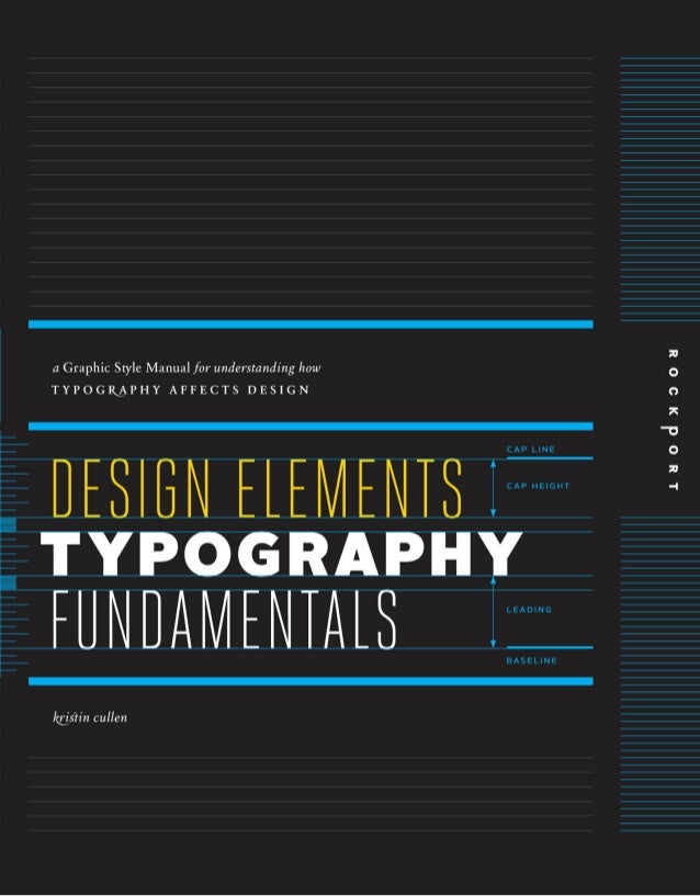 |
| source: www.slideshare.net/hazlinaishazainalabidin1/design-elements-typography-fundamentals-by-kristin-cullen |
Typesetting factors: Hierarchy
Without proper hierarchy, text lacks focus and visual interest and is essential for typesetting. It defines what the viewers see and facilitates navigation. Hierarchy is based on typographic, spatial and graphic factors and different combinations of these can achieve variation and emphasis. Typographic factors include change in font size, style contrasts (weight, width, etc), varying typeface combinations and baseline shifts. However, these factors should be manipulated carefully - too many can turn out being redundant and complicated while too little does not distinguish. Spatial and graphic factors, at the same time, support type for hierarchical benefit; these include spacing (tracking, kerning and leading), orientation shifts and position changes. Graphic factors including line, shape and colour also support type and aid hierarchy. Lines help in guiding the eye and colour helps distinguish elements.

Structure: alternate methods
Apart from traditional methods of arranging elements, alternate structures offer compositional options and encourages intuition and experimentation. Alternate methods are inspired by improvisation, geometry and axiality and work best for projects with limited text, while multipage forms can be difficult.


 |
| source - www.slideshare.net/hazlinaishazainalabidin1/typography-referenced-by-allan-haley-2012 |
Contemporary usage: Designing with Type
This chapter talked about contemporary type design and how designers apply this in different ways, including poster and collateral design with various interesting examples. With the widespread access of technology and mass emergence of type designers, and the difference in practice and style, the definition of a type designer is rather diluted. However, anyone who designs type, designs with type hand letters type is involved in type design.
I found these examples rather interesting, particularly those given for the posters.


Comments
Post a Comment