Publishing Design - Exercises

27/08/19 - 17/09/19 (Week 1- 4)
Azmina Fathima Haris (0337113)
Publishing Design
Exercises
LECTURES
Lecture 1: Introduction
Week 1 (27/08/19)
For our first class, we were introduced to the module and told what to expect from this semester. We were shown a few sample work and also what to bring for the next week's exercise - a cutter, ruler and sheets of A3 paper.
Lecture 2: Formats
Week 2 (3/09/19)
In this week's class, we started with a class on the different formats of publishing, our focus being on books. We discussed the different factors that determine the format and design of a book - the target audience, the book's content and so on. We also learned about how publishing came to be the way it is today, starting with ancient civilisations around the world - Mesopotamian, Indus Valley and Ancient Egypt civilisation to name a few. We also looked at the formats used then, and the materials used to create them.
INSTRUCTIONS
EXERCISES
Mockup making (Week 2)
Our first exercise was to create sample book sizes on a sheet of folded A3 paper - these should be between A4 (210x297mm) and A5 (148x210mm) size. We were asked to create three different ones and then select and highlight the one we felt most comfortable with. This was the size chosen for the mockup and also for our project. The sizes I outlined were 165x215mm, 160x225mm & 156x218mm.
I selected 165x215mm as the size for my mockup as it felt most comfortable. Then, we were asked to create a mockup book with 8 sheets of paper, 32 pages. Once we were done folding our sheets, we were shown how to do staple binding and we were asked to try it out ourselves.
 |
| Fig. 1.1 Sizes for mockup |
 |
| Fig. 1.2 Staple binding (outside markings) |
 |
| Fig. 1.3 Staple binding (inside) |
 |
| Fig. 1.4 Final outcome of mockup |
Van de Graaff Grid (Week 3)
For this week's exercise, we created the Van de Graaff grid using A3 paper and folded it to created a grid system that we could use for our own mockup.
 |
| Fig. 1.5 Van de Graaff grid mockup on A3 paper |
We did the same in InDesign using the dimensions of our book.
 |
| FIg. 1.6 Process in InDesign |
 |
| Fig. 1.7 Completed Van de Graaff grid for my mockup |
Signature Folding System (Week 3)
Our second exercise we worked on was signature folding. We were asked to fold a sheet of A3 paper thrice and then number the sides from one to sixteen; and one signature in a book is equivalent to 16 pages. Mr. Vinod also explained how the CMYK printing system works.
 |
| Fig. 1.8 Threefold mockup (16 pages) |
 |
| Fig. 1.9 Binding of mockup |
 |
| Fig. 2 Pages (front) |
 |
| Fig. 2.1 Pages (back) |
Grids (Week 4)
For this exercise, we were asked to select samples of grid systems from two different books, with three spreads from each. Then, we had to study the structure and draw lines to show its margins. This was the outcome for the exercise.
 |
| Fig. 2.2 Book #1 |
 |
| Fig. 2.3 Book #1 |
 |
| Fig. 2.4 Book #1 |
 |
| Fig. 2.5 Book #2 |
 |
| Fig. 2.6 Book #2 |
 |
| Fig. 2.7 Book #2 |
FEEDBACK
Week 2
General feedback: Mr. Vinod told us that we should have our written content finalised by today so we can proceed with our visuals. We were reminded that we don't have to make our visuals very detailed and could also be more abstract to leave some room for reader's imagination.
Specific feedback: My written content was alright but Mr. Vinod said I should finalise on my sub-text and pull quotes so I can start working on finding references and photos for my visual content.
Week 3
General feedback: We were told we'd be working on a digital exercise next week and wouldn't require cutters or paper.
REFLECTIONS
EXPERIENCES
Week 1: I was looking forward to this module a lot and when we briefed about our work this semester, I found myself getting a lot of ideas but I wasn't sure of how to proceed and with what.
Week 2: This module already a felt a lot different from our classes in the previous semesters and I felt much more relaxed.
Week 3: I was able to focus better on the exercise this week as we started working on them right away instead of starting with the lecture first.
OBSERVATIONS
Week 1: I knew I had to think of a good topic right away so that I would be able to come up with good visuals, that I would be able to work with for the other projects.
Week 2: Although it might've been a simple exercise to start off with, I found it rather stressful with my obsessive tendencies but it turned out alright anyway.
Week 3: This week's exercise might have been a bit confusing for me even though I didn't realise it first - I couldn't get the grid to be the same on both sides and one side ended up a little wider
FINDINGS
Week 1: Seeing our seniors' work was very inspiring and publishing felt all the more exciting.
Week 2: Staple binding was something new to all of us and it was interesting doing it ourselves; I had always wondered how it was done.
Week 3: It was interesting to learn a bit more about the printing process and it made me realise how much planning went into publishing a book - and consequently how much paper would have to be scrapped as a result of even a tiny mistake when calculating and making approximations.
FURTHER READING
Forms, Folds, Sizes
by Poppy Evans & Aaris Sherin
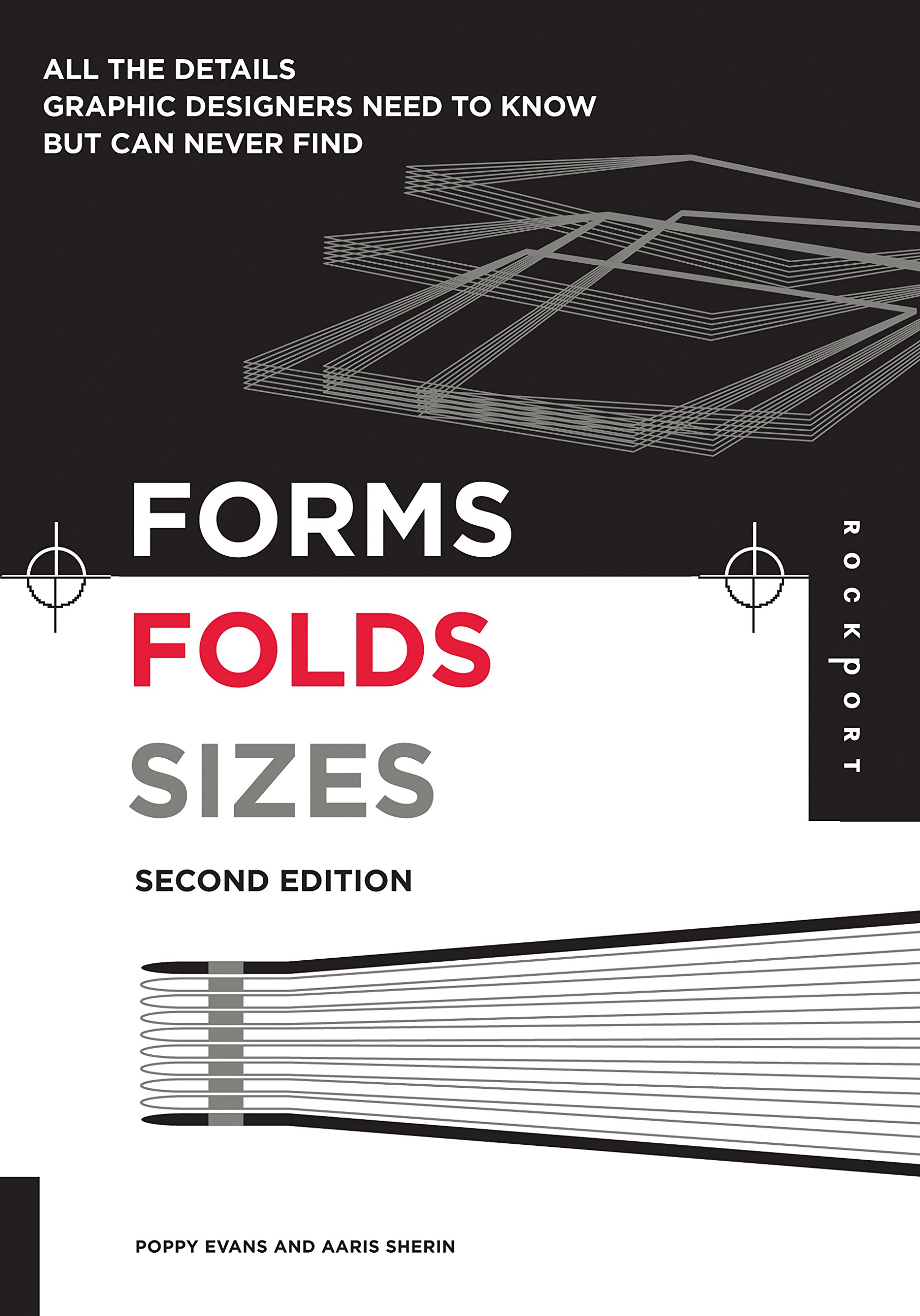
Grids use horizontal and vertical thresholds to indicate divisions of space and to provide a way for designers to determine how the interior proportions of a page should be used. Using a grid can help create a sense of continuity across a sequence of pages and are a good way to organise information and laying out pages quickly. In the case of single-page compositions, they can help create visual harmony and aesthetically connect diverse compositional elements. They also help readers to move through and process the information more easily. This is especially true in the case of layouts that contain complex of visual elements. Grids don’t necessarily have to be a strict guideline for the designer to fold and adhere to from start to finish of a layout. Rather, they can be a starting point to come up with a more exciting experimental design.
Design Elements Typography Fundamentals : A Graphic Style Manual for Understanding How Typography Affects Design by Kristin Cullen
 Typeface combinations This chapter dealt with the selection of typefaces in combination and how the features of the typeface can affect the design. It is important to start with a dependable, legible typeface that is effective. For instance, Helvetica or Univers. A broader palette of typefaces helps distinguish content and relationships between typefaces usually two or three help to deepen the personality. In most cases, it is safe to pair a serif and sans serif typeface together. Typeface pairings should generally contrast each other and juxtapose features. Typefaces with a close similarity, like those from the same category are poorly matched and should be avoided as it would be quite redundant. It is also important to assign a specific role to each typeface involved based on its distinguishing trait - whether its comfortable for reading, or if its bold and contrasting enough to stand out on its own.

Comments
Post a Comment