Publishing Design - Project 1

27/08/19 - 17/09/19 (Week 1 - 4)
Azmina Fathima Haris (0337113)
Publishing Design
Project 1
LECTURES
Lecture 3: History of Print
Week 3 (10/09/19)
This week's lecture was on the history of print through the years and the various forms it exists in - as a 16 ft long scroll to playing cards and the Gutenberg bible.
Lecture 4: Grid
Week 4 (17/09/19)
This week, our lecture was on grids and the different kinds of grids. We also learnt more about margins, hanglines and gutter. The grid acts as a framework for arranging text and other visual elements that the designer can use as support in a way to present information.
INSTRUCTIONS
Project 1
Our first project was to create the actual content for our book, that is both text and visual content. Mr. Vinod said we could source our text from an actual publication if we want to but we have to keep the limit of 3000 words in mind. He also suggested creating visuals that are more abstract. But first for the following week, we were asked to come up with the written content for the book. These 3000 words had to be divided into (at least) 3 chapters and should also include subtexts and pull-quotes.
I wanted to pick a topic that was personal to me but foremost, I decided to choose something that I would be able to come up with interesting visuals for. After going through my photos for inspiration, I decided to write about my trip to Morocco. I wrote 4 chapters and dedicated each chapter to a city. Below is the final outcome for the written content.
After doing this, I looked into ideas for visuals and references for what planned to draw. I found some really interesting modern vintage prints and posters which I was leaning towards a bit more. Some of these I wanted to be more abstract and kept it flat with minimal detail. However, with the nature of my topic I found it rather difficult to stick to one specific colour palette for the visuals and worked on one for each chapter instead. I also came up with a few sketches.
 |
| Fig. 1. Draft sketches |
 |
| Fig. 1.1 Draft sketches |
 |
| Fig. 1.3 Inspiration for style & texture of illustrations |
 |
| Fig. 1.4 Visual references for illustrations |
 |
| Fig. 1.5 process in Photoshop |
 |
| Fig. 1.6 process in Photoshop |
 |
| Fig. 1.7 process in Photoshop |
Final outcome for visuals -
 |
| Fig. 1.8 Introduction - passport |
 |
| Fig. 1.9 Chapter 1 - Graffiti |
 |
| Fig. 2 Chapter 1 - Postcard |
 |
| Fig. 2.1 Chapter 1 - Doors |
 |
| Fig. 2.2 Chapter 2 - Souk |
 |
| Fig. 2.3 Chapter 2 - Rose-coloured glasses |
 |
| Fig. 2.4 Chapter 2 - Street sign |
 |
| Fig. 2.5 Chapter 2 - Babouche |
 |
| Fig. 2.6 Chapter 2 - Babouche |
 |
| Fig. 2.7 Chapter 2 - Babouche |
 |
| Fig. 2.8 Chapter 2 - Moroccan tea |
 |
| Fig. 2.9 Chapter 3 - Stray cat |
 |
| Fig. 3 Chapter 3 - Carpets |
 |
| Fig. 3.1 Chapter 3 - Mausoleum |
 |
| Fig. 3.2 Chapter 3 - Tile |
 |
| Fig. 3.3 Chapter 3 - Tabletop flatlay |
 |
| Fig. 3.4 Chapter 4 - Wildflowers |
 |
| Fig. 3.5 Chapter 4 - Across Gibraltar |
 |
| Fig. 3.6 Chapter 4 - Cave of Hercules |
Final outcome of visuals in Indesign (thumbnail format)
 |
| Fig.3.7 Final outcome of illustrations |
FEEDBACK
Week 2
Specific feedback: Mr. Vinod said that my written content was fine but I should finalise with all our pull quotes and subtexts and start looking for references for our visuals and start working on them right away.
Week 3
Specific feedback: Mr. Vinod said my sketches looked alright so far but said I should work on the illustrations right away.
General feedback: We were told to finish at least 3 illustrations by Friday to show him and to finish the visuals completely for next class.Week 4
General feedback: We were to make sure we're done with our visuals by next week's class so we can start with our layouts this week.
Specific feedback: I was told my work was looking good, but I should work quickly.
Week 5
Specific feedback: Mr. Vinod said that my visuals looked exciting and they were good so far.
REFLECTIONS
EXPERIENCES
Week 1: Once I got started, I found myself enjoying writing but it was a bit difficult to fill in the gaps of the trip and make sure I didn’t miss out anything too important.
Week 2: I knew for sure that I wanted to create illustrations rather than using photos or other media - I thought that I would have more control over how it would go, especially when creating animations.
Week 3: I had to make a few changes to what I decided to draw - they didn't all have to be so heavy or detailed and could be smaller in scale.
Week 4: Creating the illustrations took up much longer than I thought it would, especially because I hadn't used the software in a while
OBSERVATIONS
Week 1: Selecting a subject to write the content took quite a bit of thinking. I wanted to make sure that it was something that I could create visuals for easily.
Week 2: Unexpectedly, it was a struggle deciding which part to illustrate. I felt it would have been really interesting if I could do something abstract but I realised it wouldn't work with my theme all too well.
Week 3: As much as I tried, it was hard for me to stick to one specific style and one way or another I'd deviate back to what I usually do, which is detail as much as possible and make it look realistic.
Week 4: Working on my illustration was a process that turned out to be a lot more tedious than I had expected and in the process, it felt very inconsistent.
FINDINGS
Week 1: My chapters were of varying lengths and I was unsure of whether this was acceptable or not.
Week 2: As I started working on the visuals, I felt unsure of the direction I was heading in. My illustrations didn’t look too cohesive to me.
Week 3: While the whole process of creating the visuals seemed exciting at first, I realised that with my tendency to over-detail and perfect each one, it was hard to determine the scale of each and the hierarchy.
Week 4: I realised why it was important to have a more or less consistent colour palette to stick to throughout.
FURTHER READING
Design Elements: Understanding the Rules and Knowing When to Break Them
by Timothy Samara

Merging Type & Image
Every design project incorporates type and image and the process of combining these two very different elements is one that poses a difficult question to most designers. The challenge stems from the fundamental differences between type and everything else. The results of poorly integrates type and image is either one - type that has nothing to do with the image and the other is typography that has been so aggressively integrated with image that it becomes illegible. Finding a balance in between depends on finding areas of common ground between the limited formal quantities of type and the more varied kinds among images. Similarities between type and image are to be found in four basic attributes - shape, texture, value and rhythm.


Best Practices for Graphic Designers, Grids and Page Layouts : An Essential Guideline for Understanding & Applying Page Design Principles by Amy Graver & Ben Jura
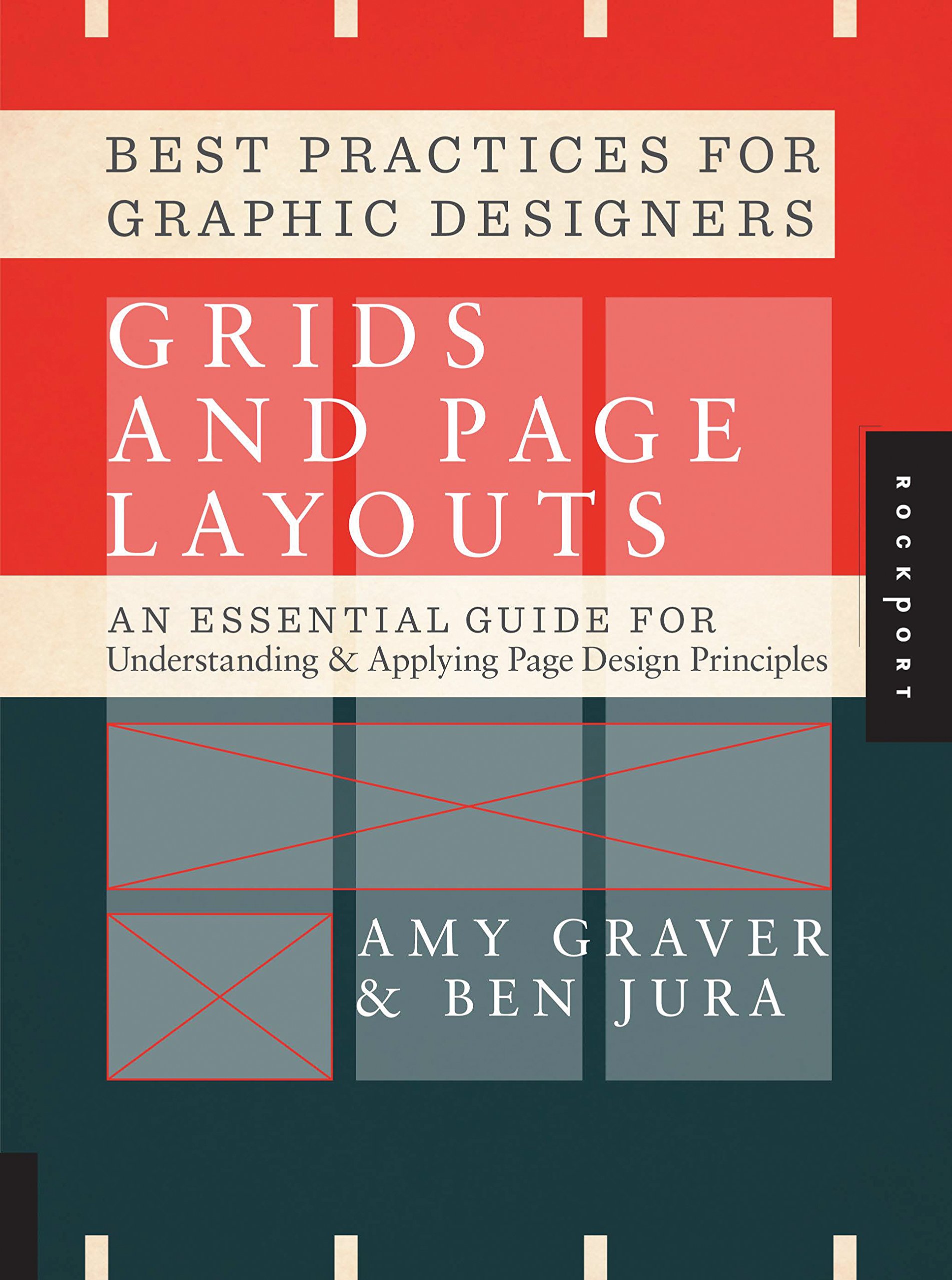
Page Structure
When considering the page structure and composition of a book, the layout should be considered both in isolation and in relation to the facing layout and the one overleaf. So even if a composition is highly impactful on its own, it may not be successful if it does not work with its facing page.
Content Structure
After determining the shape and format of the piece, the next step is to figure out the structure of the content. The target audience and how the story is unraveled requires thought and planning. The communication should be built in a way that is legible and and believable to the audience and fits the content. In structuring the content, the designer needs to be extremely familiar with it so they are able to group the information correctly. For instance, what sort of big picture is implied by giving two statements the same weight? Similar content should make sense when viewed together and all similarly tiered content that occupies the same page should form a cohesive unit. The overall story must be build in a sensible manner.


Comments
Post a Comment