Heading - Katibeh Regular (40pt)
Body - Gill Sans Regular (9pt)
Subtext - Gill Sans Italic (7pt)
Pull-quote - Normandie Regular (19pt)
 |
| Fig. 1.2 Specimen #3 |
Heading - Moon 2.0 Bold (35pt)
Body - Moon 2.0 Regular (9pt)
Subtext - Moon 2.0 Light (7pt)
Pull-quote - Chonburi Regular (27pt)
References for grid and layout -
Grids specimen -
 |
| Fig. 1.3 Specimen #1 |
 |
| Fig. 1.4 Specimen #2 |
 |
| Fig. 1.5 Specimen #3 |
Once I found some references and made thumbnail sketches of the layout, I started working on the layout in InDesign. I decided to stick to my first type specimen sheet and the third grid system (3 columns). In class, our first task was to complete till the end of the introduction.
First attempt (experimental layout)
 |
| Fig. 1.6 Attempt 1 done in class (until introduction) |
Once we were done working on the layout in class, we were told to print thumbnails.
Feedback:
I made changes to my design and worked on this till the end of chapter 1 for next week. Thumbnails of my work till the end of chapter 1 -
 |
| Fig. 1.7 Attempt 1 (until chapter 1) |
Feedback:
For the following week, we were asked to complete it till the end. We were to print thumbnails beforehand so we could make any changes and complete the project by the end of class. My work till the end of chapter 4 -
 |
| Fig. 1.8 Attempt 2 - page 1 to 11 |
 |
| Fig. 1.9 Attempt 2 - page 12 to 23 |
 |
| Fig. 2.0 Attempt 2 - page 24 to 29 |
After making the changes Mr. Vinod suggested for my double spreads, and also for the colours used. We were also told to add the page numbers.
 |
| Fig.2.1 Attempt 3 Pages 1-11 |
 |
| Fig.2.2 Attempt 3 Pages 12-23 |
 |
| Fig.2.3 Attempt 3 Pages 24-32 |
I added my references, made some more changes to the body text and also changed the double spread in chapter 3.
Book covers -
 |
| Fig 2.4 Book cover attempt 1 |
 |
| Fig 2.5 Book cover attempt 2 |
 |
| Fig 2.6 Book cover attempt 3 |
I decided to go with the second cover, as Mr. Vinod felt that looked better compared to the others. He felt the colours looked better in this one and I was asked to try printing it in black and white to see how it looked.
Final work
Thumbnails -
 |
| Fig.2.7 Final work (pages 1-9) |
 |
| Fig.2.8 Final work (pages 10-18) |
 |
| Fig.2.9 Final work (pages 19-27) |
 |
| Fig.3.0 Final work (pages 28-36) |
PDF thumbnails -
PDF file -
These are the 10 best spreads from the final book:
 |
| Fig. 3.1 Spread #1 |
 |
| Fig.3.2 Spread #2 |
 |
| Fig.3.3 Spread #3 |
 |
| Fig.3.4 Spread #4 |
 |
| Fig.3.5 Spread #5 |
Before printing the final copy of the book, we were told to first try printing a black and white mockup.
 |
| Fig.4.1 Black & white mockup |
 |
| Fig.4.2 Black & white mockup |
After receiving feedback on the final outcome and making a few more minor changes to the cover, I proceeded to print the hardcopy of the book.
 |
| Fig. 4.3 Printed outcome (book cover) |
 |
| Fig. 4.4 Printed outcome |
 |
| Fig. 4.5 Printed outcome |
 |
| Fig. 4.6 Printed outcome |
 |
| Fig. 4.7 Printed outcome |
 |
| Fig. 4.8 Printed outcome |
 |
| Fig. 4.9 Printed outcome |
 |
| Fig. 5 Printed outcome |
 |
| Fig. 5.1 Printed outcome |
 |
| Fig. 5.2 Printed outcome |
 |
| Fig. 5.3 Printed outcome |
 |
| Fig. 5.4 Printed outcome |
 |
| Fig. 5.5 Printed outcome |
 |
| Fig. 5.6 Printed outcome |
 |
| Fig. 5.7 Printed outcome |
 |
| Fig. 5.8 Printed outcome |
 |
| Fig. 5.9 Printed outcome |
 |
| Fig. 6.0 Printed outcome |
 |
| Fig.6.1 Printed outcome (back cover) |
 |
| Fig.6.2 Staple binding |
With the book sleeve from Packaging & Merchandising Design class:
 |
| Fig. 6.3 Book sleeve (outside) |
 |
| Fig. 6.4 Book inside sleeve |
FEEDBACK
Week 5
General feedback: Mr. Vinod told us to make sure we complete the layout until the end of chapter one by next week.
Specific feedback: For my layouts, Mr. Vinod suggested looking into my references and creating thumbnail sketches before picking one. He also told me to try playing around with my title for the title pages.
Week 6
General feedback: We were told to make sure that our body text was connected throughout and not in separate text boxes.
Specific feedback: (1st attempt) Mr. Vinod went through the layouts I worked on for chapter 1 and suggested some changes. He told me to make sure that it consistent - my headings and body text were often not starting at the same point and it got confusing. He said the same for my full title & half title pages and said it should be never look too different and should follow a similar layout.
(2nd attempt) Mr. Vinod suggested a few more additions/changes to the arrangement of visuals after showing him what I had worked on in class. I was also told to make minor changes to the length of the paragraph (in the 3rd spread) so that it would appear more symmetrical.
Week 7
Specific feedback: As I didn't have too many double spreads, I was told to make more so that it would act as a break between chapters. Since, I used a combination of smaller illustrations within the bodies of text, he said I could use a spread for just one that way. I was also told to make sure my body texts reach till the margins.
REFLECTIONS
EXPERIENCES
Week 5: I felt unsure of the direction I was heading in when it came to layout and structure of my book and I felt that with my theme, it had many possibilities.
Week 6: Working on the layouts was rather overwhelming; realising that there are many different directions you can go in with only so much time left was a rather daunting thought.
Week 7: This class got stressful at first and I felt rather lost - I was told to make some major changes and I felt really pressured to come up with something new.
OBSERVATIONS
Week 5: I found it rather difficult to find (reliable) references for the layout and grid for the book - they either felt too formal, too restricting and were all tailored for magazines. It was hard to find clearcut grids involving illustration that were bold, yet fun and fitting my theme.
Week 6: Most of us had similar ideas when it came to the layout even though a lot of our topics were very different from one another’s .
Week 7: I initially thought I had too many large, detailed illustrations but instead I ended up making all of them in a smaller scale, which did not work out well in the end.
FINDINGS
Week 5: I found myself looking forward to this task a lot more than I expected to after class - despite the fact that it would involve a lot of trials and experimenting.
Week 6: I realised I was applying a lot from what I learnt in the previous semesters without really realising it, especially typographic systems.
Week 7: I felt that colour was perhaps the most important element in my layout as each chapter was divided by colour.
FURTHER READING
Layout Essentials: 100 Design Principles for Using Grids
by Beth Tondreau
This book gave a good insight into the basic components of a grid The components of a grid are margins, markers, columns, flowlines, spatial zones and modules. Content, margins, amount of imagery, desired number of pages all factor into deciding how to set up a grid. The kind of material should be assessed first before determining the kind of grid to be used. The grid to be used depends on the specific design problem, but there are some general guidelines.
- Single-column grids are used when working with continuous text, such as an essay or a book. A single column of text also may seem more luxurious and less intimidating so it could be also be suitable for art books and catalogues.
- Two-column or multiple-column grids afford flexibility when dealing with more complicated material. Multiple column grids are often used by websites to manage a huge range of information including videos, stories and ads.
- Modular grids help to arrange units of information into manageable chunks, like in newspapers or magazines.
Design Elements: using Images to Create Graphic Impact: a Graphic Style Manual for Effective Image Solutions in Graphic Design
by Aaris Sherin
15 Rules for working with imagery
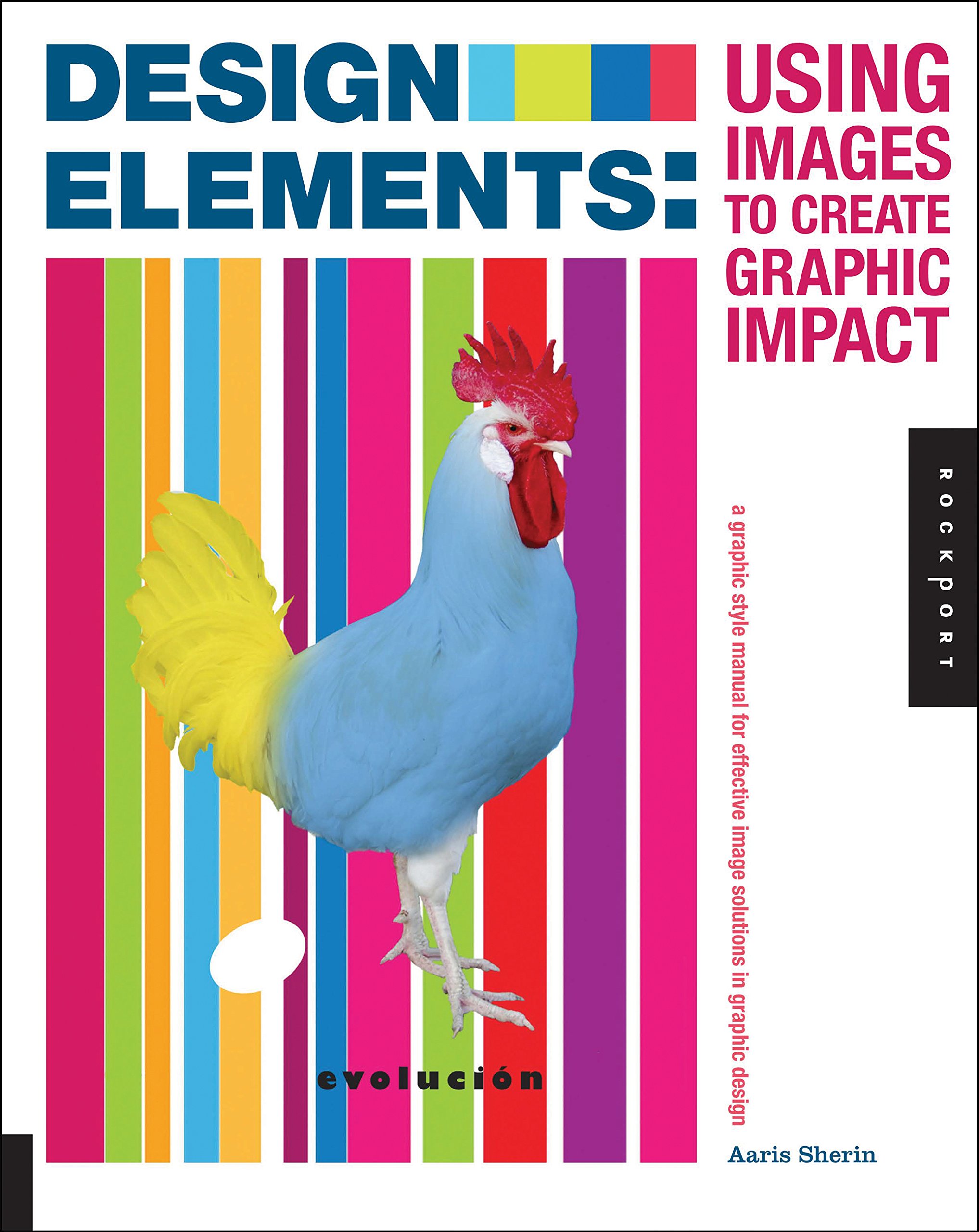
This section covered conventions and guidelines to follow in graphic design when using imagery or any kind of visuals. The first was to decide on an overall direction - to research into formats of imagery that will be appropriate for the project and for the desired output and will enhance the message. Second is to consider the budget of the project - if it is possible to commision photography or illustration. Next is to get client approval on style, look and feel before commissioning imagery. Fourth, is to create it yourself so that it could be more effective visually. Fifth is to use various techniques like animation, stop-motion, etc to create design that impactful and unusual. Next is to ensure that the imagery suits the audience and is specific to culture, gender and age of the target audience. Design for context is the next rule - imagery should be used in a way that appropriate to the context. Next, hierarchy should always be maintained. Compositions should also be balanced effectively in terms of colour, visual elements and value. Imagery is also a great way to catch and hold a viewer's attention. It is also important to assess the image choices in progress and consider whether they enhance or detract from the content. The last guidelines are to revise, evaluate and prepare the imagery for production depending on its intended purpose - digitally or in print.
Making and Breaking the Grid: a Graphic Design Layout Workshop
by Timothy Samara
Breaking the grid
When seeking for compositional options beyond the grid, it is not necessary to abandon the structure completely. One possibility is deconstruction: taking apart a grid and subverting it to create new spatial relationships. But there also many other kinds of structure that happen to not be based on a logic of repeating, modular or orthogonal geometry. These may be derived from nature, sach as seen in crystals or molecules or tree branches.

Another option is alter a more standard, familiar structure like two or three column grid by manipulating it along its axis, for instance. The designer could do so by creating a base grid first and then separating the individual grids at irregular intervals. However, it is important to watch what happens when information that would normally appear in an expected place - making a structural juncture in the grid is now moved to another place, creates a verbal connection that may not have existed before. Dimensional deconstruction and distortion is another way of breaking the grid. groups of flowlines and column lines are distorted to explore possibilities of exaggerated dimensionality. This also creates a more organic effect and gives the diagonal axis more emphasis.


Comments
Post a Comment